
Optimising ML classifiers with ROC-AUC
How to determine the optimal thresholds for classifiers by investigating the TPR and FPR rates.

Hello fellow machine learners,
Last week, we introduced the concept of performance metrics and explained how to depict them with the confusion matrix. That article acts as a base for this one, so be sure to read it first:
This week, we’ll begin by covering some additional performance metrics that we didn’t have time for last week, before discussing how to compare binary classifiers using the Receiving-Operator Characteristic curve.
Note that, in the following discussion of binary classifiers, we will assume a reasonable balance between the classes.
Let’s get to unpacking!
Other performance metrics
First, some metrics that we didn’t cover last time:
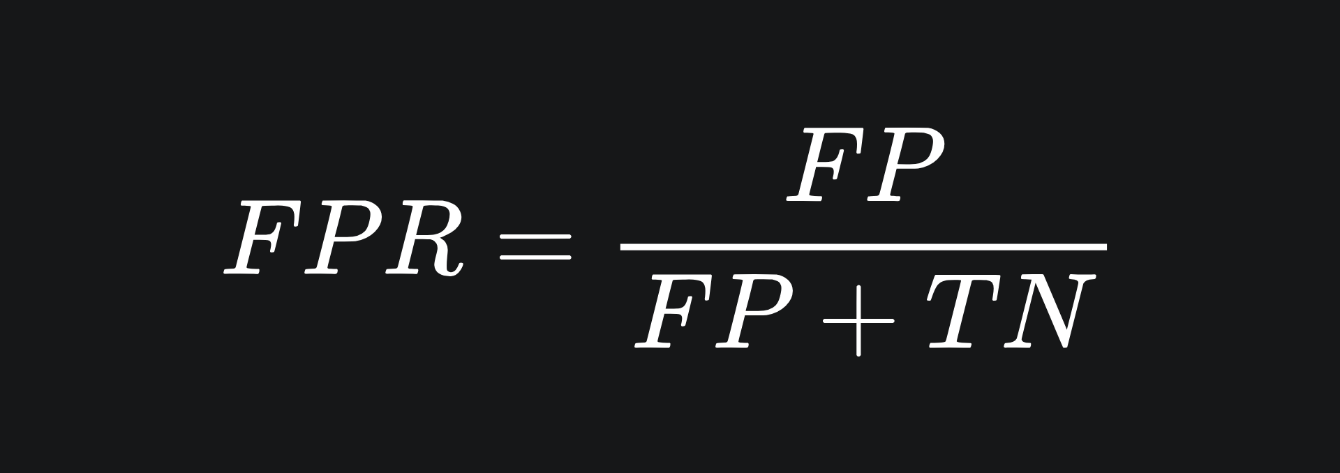
❓ False Positive Rate: the proportion of negative data points that are incorrectly predicted as positive. This concerns the second column of the confusion matrix:
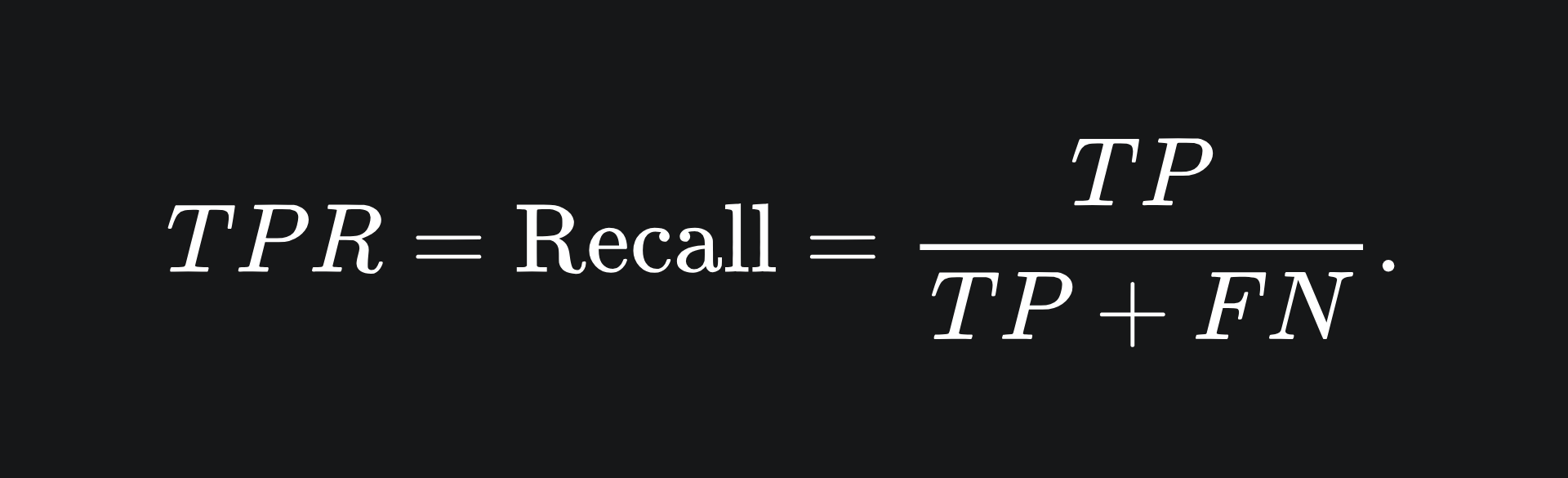
❓ True Positive Rate: this is the same as recall, which we discussed last week:
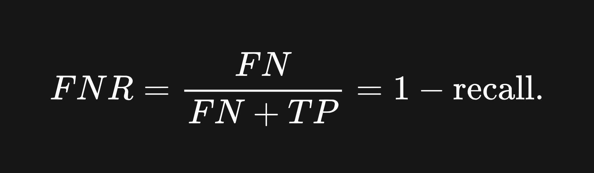
❓ False Negative Rate: the proportion of actual positive data points that were incorrectly labelled as negative:
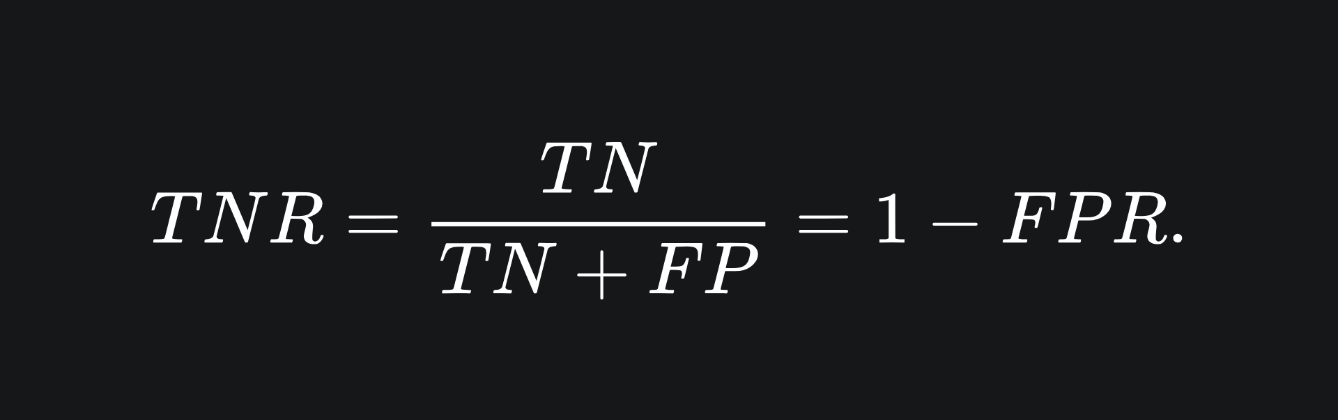
❓ True Negative Rate: the proportion of negative data points that are correctly predicted as negative:
The final two metrics in the above are less commonly used.
Receiver Operating Characteristic
Cast your mind back to the logistic regression model (link here for a recap!).
Once the model has learnt the optimal parameters w and b, the value of threshold is used to determine the final classification of any data input:
if σ(w*x + b) >= threshold:
return 1
else:
return 0
(As always, I think of the output ‘1’ as ‘colour the data point green’, and the output ‘0’ as ‘colour the data point red’.)
The variable threshold can take any value between 0 and 1. As such, different thresholds can yield different classification results:
Suppose we have built a logistic regression model that classifies the points above the threshold as green and below the threshold as red:
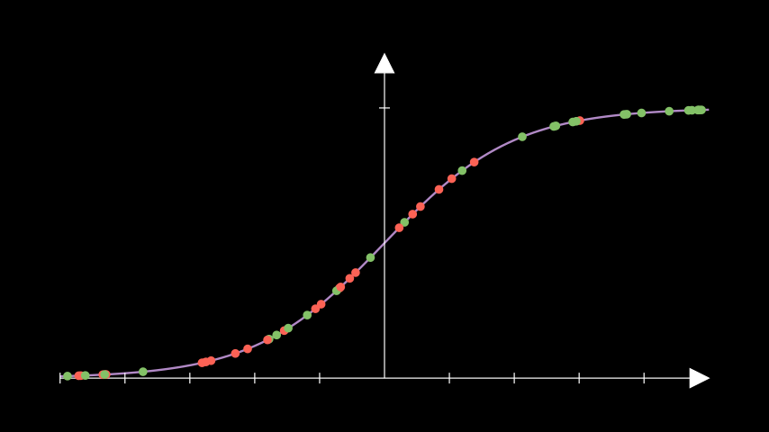
We can see that there are mostly green points on the right side with quite a few red points on the left and middle. We want to optimise the threshold we use so that the best possible classifier can be constructed.
This could perhaps be achieved visually, but this will be far more difficult to do when working with lots of data points, such as in the above image. What we can do instead is as follows: for each threshold, compute the TPR and FPR rates and plot them on the y-axis and x-axis respectively of a graph. This could look something like the following, where the x-axis of the left plot represents the sigmoidal outputs from an example logistc regression model:
When the threshold is at 0, all data points will be classified as green. So all actual green points will be correctly classified, yielding a perfect TPR of 100%. However, all red points will be incorrectly classified be default, and so the FPR will also be at its maximum. Thus, the ROC curve starts at the point (1,1).
If the threshold is at 1, all data points will be classified as red. The corresponding confusion matrix will have zero values for both true positives and false negatives, yielding zero values for both TPR and FPR. Hence, the ROC curves ends at (0,0).
What about random guessing? Well, supppose that you make the colour prediction of green half the time. Assuming your dataset is balanced, you will be right roughly half the time. This means that half of the actual green points will be predicted green and half of the actual red points will be misclassified. The former means that the TPR is about 50%, and the latter means that the FPR is about 50%. This corresponds to the point (0.5,0.5) on the ROC curve.
Similarly, if you randomly predict x% of the data points to be green, then roughly x% of the actual greens will be classified correctly and roughly x% of the actual red points will be misclassified. Predictions of this type sketch out an ROC line from (0,0) to (1,1).
Our hope as ML model builders is that the models created are able to make predictions based on patterns in the data. So we certainly want models that do a better job than random guessing. Therefore, we are looking for models with ROC curves above the line y=x.
Which threshold?
Naturally, we will want a high TPR and a low FPR. So the optimal threshold will be one that gives rise to one of the data points near the top left of the ROC plot.
The specific choice of threshold may depend on the context of your ML problem. For example, if considering the medical disease diagnosis scenario from last week’s article, we really do not want false negatives in our classifications. This means we may be more tempted to use a slightly higher threshold which has a higher TPR, at the expense of a potentially higher FPR.
But if FPR isn’t a concern in your business problem, then you may instead want to choose a larger threshold for the higher TPR, even if the point on the ROC curve is slightly further away from the top-right corner.
Which model?
Fortunately, the ROC curve allows us to directly compare different binary classifiers. More specifically, the more robust classifier will have an ROC curve that is more skewed toward the upper-left of the graph. Consider the two curves depicted below:
If the two ROC curves corresponded to two distinct classifiers, then we can tell at a glance that the second model (the one with the orange ROC) is more robust. Remember that the plots on the left are being shown here for clarity: real-world datasets aren’t as easy to visualise, hence the need for ROC in the first place.
Area Under the Curve (AUC)
Classifier robustness can also be ascertained from the area under the ROC curve. This makes intuitive sense; the larger the area under the ROC curve, the more of the [-1,1]x[-1,1] box the ROC takes up. So naturally, the curve must be more skewed toward the upper left hand corner, which is what we’re looking for.
Another way to think about it: the perfect classifier would have a TPR of 1 and an FPR of 0. If this remained true across all thresholds, then the ROC curve would be a horitzontal line from (0,1) to (1,1), the area underneath which is precisely 1.
Packing it all up
Building ML models is one thing, but evaluating them in the right way is another. By understanding different performance metrics and methods of comparing models, you can make the best model selections with confidence.
And now for the usual summary:
The Receiver Operating Characteristic helps us figure out the optimal threshold for our classifier.
The best exact choice of threshold with respect to the ROC curve depends on your ML context, which is where last week’s article comes in quite handy.
Different binary classification models can be compared via their ROC curves. The model with the ‘higher up’ curve is generally the more robust model.
The Area Under the Curve can also be used to compare different binary classifiers. In general, we want an AUC value that’s as close to 1 as possible.
Training complete!
I hope you enjoyed reading as much as I enjoyed writing 😁
Do leave a comment if you’re unsure about anything, if you think I’ve made a mistake somewhere, or if you have a suggestion for what we should learn about next 😎
Until next Sunday,
Ameer
PS… like what you read? If so, feel free to subscribe so that you’re notified about future newsletter releases:
Sources
“Visualising the decision rules behind the ROC curves: understanding the classification process”, by Sonia P, Pablo M, Peter F and Norberto C: https://link.springer.com/article/10.1007/s10182-020-00385-2
“Introduction to ROC analysis”, Tom Fawcett: https://www.researchgate.net/publication/222511520_Introduction_to_ROC_analysis